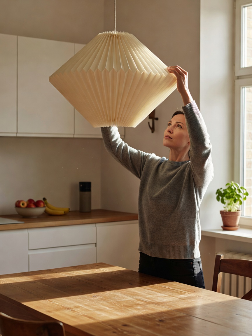
The three layers of light
A single ceiling fixture flattens a room. Designers build light in three layers, each with its own job:
- Ambient: general illumination from ceiling fixtures, wall washers or bounced uplighting. It should be dimmable.
- Task: focused light where you read, chop or work — desk lamps, under-cabinet strips, reading lamps beside a sofa.
- Accent: lower-level light that adds depth: picture lights, shelf lighting, a small lamp in a dark corner.
In the evening, a room lit mostly by three or four lamps at different heights feels calmer than the same room under a bright overhead light. Aim for at least one light source in each corner of a living room.
Colour temperature and CRI
Colour temperature, measured in kelvin (K), describes how warm or cool light looks. 2700K matches the glow of a traditional incandescent bulb and suits living rooms and bedrooms. 3000K is slightly crisper and works for kitchens and bathrooms. 4000K and above feels clinical in most homes and is best kept to garages and workshops. Do not mix temperatures in one room — it is the most common reason a scheme "feels off".
The Colour Rendering Index (CRI) measures how faithfully light shows colours compared with daylight. Choose LED bulbs rated CRI 90 or higher; below about 80, wood looks grey and skin tones look sallow, undermining any colour palette you have chosen.
Fixture types compared
| Fixture | Layer | Best placement | Design reference |
|---|---|---|---|
| Layered-shade pendant | Ambient / task | Over dining tables | PH5, Poul Henningsen, 1958 |
| Arc floor lamp | Task / ambient | Beside or over a sofa | Arco, Castiglioni brothers, 1962 |
| Paper lantern | Ambient | Bedrooms, living rooms | Akari, Isamu Noguchi, 1951 |
| Wall sconce | Accent / task | Hallways, bedside | Swing-arm reading lights |
| Table lamp | Accent | Sideboards, corners | Opaque shades limit glare |
The PH5, still made by Louis Poulsen, was designed so that the bulb is never visible from normal viewing angles — a principle worth copying with any pendant. For dining, hang the bottom of the shade 70–85 cm above the tabletop; over a long table, use two or three smaller pendants rather than one large one.
Decorative accessories without clutter
Elsie de Wolfe, often called America's first professional interior decorator, argued in The House in Good Taste (1913) for "simplicity, suitability and proportion". Those three words remain a good filter for every vase and cushion.
Rugs
Size up. In a living room, at least the front legs of every seating piece should sit on the rug. Under a dining table, the rug should extend 60–75 cm beyond the table edge on all sides so chairs stay on it when pulled out. Under a bed, allow 45–60 cm of rug beyond each side.
Art and mirrors
Hang art so its centre sits around 145–152 cm from the floor — the gallery standard. Above a sofa, leave 15–25 cm between the sofa back and the frame bottom. A mirror placed opposite or beside a window doubles the daylight in a room; facing a cluttered wall, it doubles the clutter.
Shelves and surfaces
- Group objects in odd numbers — three or five — and vary their heights.
- Leave about a third of each shelf empty so the objects can breathe.
- Repeat one material (brass, ceramic, oak) at least three times across a room.
- Lay some books flat and stack others upright to create rhythm.
Cushions and throws
Mix one patterned cushion, one textured solid and one plain solid in a palette drawn from the room's existing colours. Feather inserts one size larger than the cover give a fuller look. To pick the colours themselves, see our palette guide.